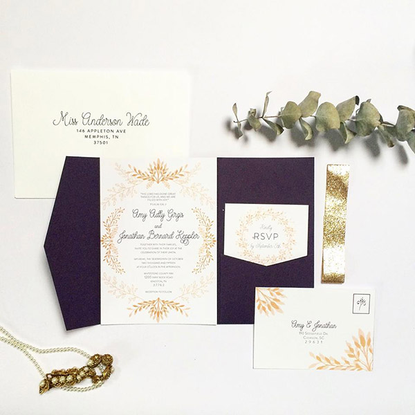
Courtney’s delicate use of wheat and floral elements along with charming topography and gold glitter belly band makes this a very simple yet lovely invitation.
Design Recipe:
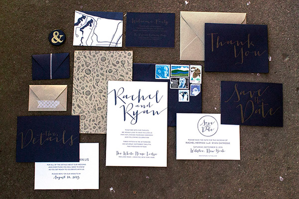
Rachel Oatridge – Second Place

Rachel used the rich imperial blue color in combination with bold large lettering to make a classy and modern suite. We loved the consistent look carried through all her printed materials.
“I designed and letterpress printed each piece of this invitation suite.
For my save the date cards, I used the Imperial Blue text weight paper with metallic gold ink for the one side and a white cotton paper with navy blue ink for the other. I ended up using an adhesive to create the double-sided effect with the two sheets of paper. I also hand-painted a little magnet as a reminder with an ampersand on the front and our names and wedding date on the back.
For the invitations themselves, I knew I wanted to do the double-sided paper effect again. I designed a seamless, vintage-inspired pattern that I used in various places throughout the wedding which I letterpress printed on Gold Leaf text weight paper in a navy blue ink, while on the front of the main card I used navy ink on a white cotton paper. I used a similar technique for the details card, which directed guests to our wedding website and gave instructions on how to RSVP. I also created a small invite for our rehearsal dinner that had a map to the venue printed on the back. Each piece was put together by hand with a roll of adhesive to achieve the look I wanted.”
Design Recipe:
- Imperial Blue A7 Envelope
- Imperial Blue RSVP Envelope
- Gold Leaf RSVP Envelope
- Printed Invite and Inserts
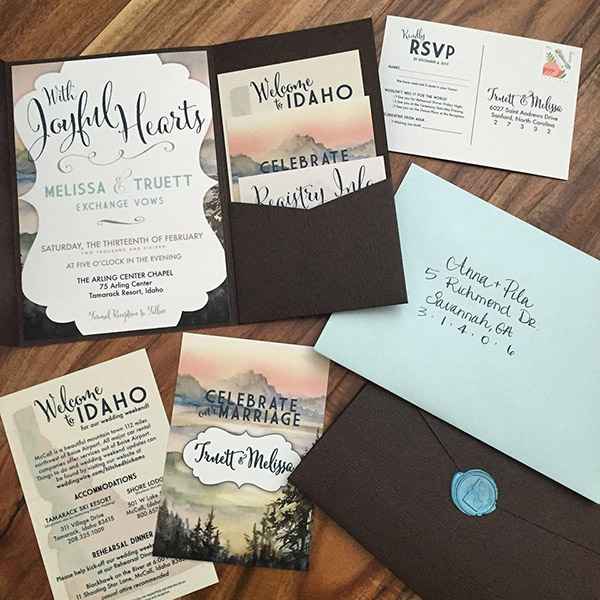
Kelly’s beautiful watercolor landscape worked perfectly with the woodgrain pocket for a very unique and happy look. We love the Idaho wax seal!
Design Recipe:
- Bubinga Signature Pocket Invitation
- Aquamarine A7 Envelope
- Printed Signature Invite and Inserts
- Blue Sealing Wax


